This document requires Netscape 3.x or compatible Web Browser.


UT Bullet Biostatistics for the Clinician

Biostatistics for the Clinician

UT Logo

University of Texas-Houston
Health Science Center

Lesson 1.5

Exploratory Data Analysis

Lesson 1: Summary Measures of Data 1.5 - 1 UT Bullet

UT Bullet Biostatistics for the Clinician

1.5 Exploratory Data Analysis (EDA)

1.5.1 Why Important?

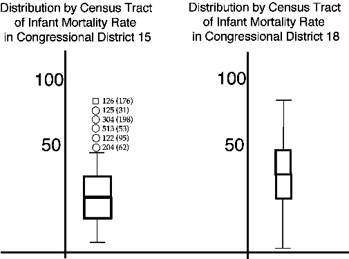
Exploratory data analysis (EDA) provides a simple way to obtain a big picture look at the data, and a quick way to check data for mistakes to prevent contamination of subsequent analyses. Exploratory data analysis can be thought of as preliminary to more in depth statistical data analysis.

1.5.2 Box Plots

A primary tool in exploratory data analysis is the box plot (see the figure below).

Exploratory Data Analysis

A small rectangular box is drawn with a line representing the median, while the top and bottom of the box represent the 75th and 25th percentiles (3rd and 1st quartiles), respectively. If the median is not in the middle of the box the distribution is skewed. If the median is closer to the bottom, the distribution is positively skewed. If the median is closer to the top, the distribution is negatively skewed. Extreme values and outliers are often represented with asterisks and circles (again see the figure).

What does a box plot tell you? You can, for example, quickly determine the central tendency, the variability, the quartiles, and the skewness for your data. You can quickly visually compare data from multiple groups.

Exploratory Data Analysis
Practice
Exercise 1:
Exploratory data analysis often uses box plots.

No Response
True
False


Exploratory Data Analysis
Practice
Exercise 2:
Box plots do not necessarily show you the:

No Response
Median
Mean
Skewness
Quartiles


Lesson 1: Summary Measures of Data 1.5 - 2 UT Bullet

UT Bullet Biostatistics for the Clinician

1.5.3 Hinges

The top and bottom edges of the box plot (the 3rd and 1st quartiles) are referred to as Tukey's hinges or just hinges (see Figure above).

Exploratory Data Analysis
Practice
Exercise 3:
What percentage of the data lies between the top and bottom edges of a box plot?

No Response
25%
50%
75%
100%


Lesson 1: Summary Measures of Data 1.5 - 3 UT Bullet

UT Bullet Biostatistics for the Clinician

1.5.4 Ranges

The range for any set of data measured on ordinal scales on up is just the maximum score minus the minimum score. For qualitative variables measured on nominal scales the range is the number of categories having at least one entry. The range then is a very crude measure of the degree of variability. Box plots easily represent the interquartile range as the distance between the top and bottom edges of the box. By definition the semi-interquartile range is half the interquartile range, or half the height of the box. You can see then that the semi-interquartile range value for ordinal data can be thought of as being conceptually similar to the standard deviation for quantitative data. In a normal distribution approximately 68% of the distribution lies within one standard deviation of the mean. In any distribution including those with ordinal data, 50% of the distribution lies within one semi-interquartile range of the median. (see the figure below).

Ranges
Ranges

Exploratory Data Analysis
Practice
Exercise 4:
The difference between the maximum and minimum values is the:

No Response
Interquartile range
Semi-interquartile range
Range
Standard deviation


Lesson 1: Summary Measures of Data 1.5 - 4 UT Bullet

UT Bullet Biostatistics for the Clinician

1.5.5 Outliers

Outliers and extreme values are often represented with circles and asterisks, respectively. Outliers are values that lie from 1.5 to 3 box lengths (the box length represents the interquartile range) outside the hinges. Extreme values lie more than 3 box lengths outside the hinges. In a box and whisker plot the actual values of the scores will typically lie adjacent to the outlier and extreme value symbols to facilitate examination and interpretation of the data (see the figure below).

Distribution by Census Tract of Infant Mortalities
Exploratory Data Analysis

Exploratory Data Analysis
Practice
Exercise 5:
Which are farthest from the middle of the distribution?

No Response
Hinges
Outliers
Extreme values
Ranges


Lesson 1: Summary Measures of Data 1.5 - 5 UT Bullet

UT Bullet Biostatistics for the Clinician

1.5.6 Box & Whisker plots

Box and whisker plots represent more completely the range of values in the data by extending vertical lines to the largest and smallest values that are not outliers, extending short horizontal segments from these lines to make more apparent the values beyond which outliers begin (see Figure above).

Exploratory Data Analysis
Practice
Exercise 6:
Box and Whisker plots make obvious which values are outliers and extreme values and which values are not.

No Response
True
False


Distribution by Census Tract of Infant Mortalities
Infant Moralities Plots

The above figure shows box and whisker plots of infant mortality in Houston Texas in 1978 showing two congressional districts 15 & 18. What you see in the middle of the box is the median (about 20 deaths per thousand live births). And, you see some census tracts as outliers (on the left) and the number of live births in those census tracts on the right. The vertical axis shows the ratio of infant mortalities. So, there were about a hundred deaths per thousand live births in census tract 126 (with apparently 176 live births). Here in Houston Texas you have had infant mortality rates that approach those in Bangladesh and other undeveloped countries. Here the use of box and whisker plots shows you those extremes very dramatically.

Exploratory Data Analysis
Practice
Exercise 7:
Box and Whisker plots can be used to quickly illustrate important differences between distributions of data.

No Response
True
False


Final Instructions

Press Button below for your score.

  • After completing Lesson 1.5, including all practice exercises, press the "Submit... " button below for Lesson 1.5 research participation credit.
  • After you press "Submit..." it is possible Netscape may tell you it is unable to connect because of unusually high system demands. If you receive no error message upon submission you're OK. But, if Netscape gives you an error message after you press the "Submit..." button, wait a moment and resubmit or consult the attendant.
  • Finally, press the "Table of Contents..." button below to correctly end Lesson 1.5 and return to the Lesson 1 Table of Contents so you may continue with Lesson 1.6.

End Lesson 1.5
Exploratory Data Analysis


Lesson 1: Summary Measures of Data 1.5 - 6 UT Bullet