This document requires Netscape 3.x or compatible Web Browser.


UT Bullet Biostatistics for the Clinician

Biostatistics for the Clinician

UT Logo

University of Texas-Houston
Health Science Center

Lesson 2.0

Review of Lesson 1

Lesson 2: Inferential Statistics 2.0 - 1 UT Bullet

UT Bullet Biostatistics for the Clinician

2.0 Review of Lesson 1

2.0.1 Variables and Measures

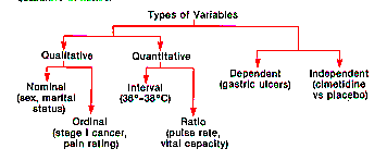
In lesson 1 you learned about types of variables. You learned about nominal variables. You learned about ordinal variables. You learned about interval variables and ratio variables. One of the most important points had to do with the fact that varying amounts of information are contained in the different types of variables. So, if you have a variable that's measured on an interval scale like temperature, you don't want to collapse adjacent values together, making categories or ranges of interval variables (e.g., High, Medium, Low) making them into ordinal kinds of variables. If you do you're throwing away information, increasing error and reducing the sensitivity of your measures . So, you want to keep them as interval variables if you possibly can. In general, you should try to capture your data in terms of the highest level of measure you can, or to put it another way, the most finely divided kind of variable.

Figure 1.1: Types of Variables
Figure 1.1 Types of Variables

Review of Lesson 1
Practice
Exercise 1:
Interval or ratio variables should not be regrouped into nominal or ordinal measures.

No Response
True
False


Lesson 2: Inferential Statistics 2.0 - 2 UT Bullet

UT Bullet Biostatistics for the Clinician

2.0.2 Central Tendency

In lesson 1 you learned about central tendency. Let's look at that graph of doctors' salaries again (see Figure 2.3).

Figure 2.3: Measures of Central Tendency
Figure 2.3 Mean, Median & Mode

Now let's make sure you understand the axes and what's represented in this graph. The horizontal axis is salary and increases from left to right. The vertical axis represents the proportion of doctors earning the salary. Looking at the graph then you can see around the middle that about 13% of physicians (if the graph were correct) had salaries around $50,000. You always need to make sure when looking at a graph in the medical literature that you understand what the axes represent. So typically you need to spend a little time checking that out.

Typically, graphs like this one show you the proportion or percent having each value. So, here you see what percent of physicians had $30,000 salaries, what percent had $50,000, what percent had $90,000 and so on. If you wanted to know what percent had $90,000 or more, you would find the area under the curve to the right of $90,000.

One thing to notice is that the way the curves are generally set up by the mathematicians, with proportions on the vertical axis, you've got the total area under the curve equal to one. That makes it easy then to tell approximately what fraction of folks are in certain categories just by looking at the curve. The darkened area of the curve here, for example, makes it obvious that about half of the doctors make less than $60,000 (the median) and about half make more than $60,000 per year.

In Figure 2.3 you can see the three measures of central tendency. Each describes in one number a measure of the central location of the data -- a measure of the performance of the group as a whole. If someone were to ask you, "How much do doctors make?", you can see that you have several choices. You could tell people the mode, that means the most frequent salary, the highest probability salary (see Figure 2.3). You could tell them the median. It's the value at which half the salaries are more and half are less, the value which splits the curve into two equal area halves. Or, you could tell them the average or mean taking all the values, adding them up, and dividing by however many you have. So, for example, if you had 15 doctors and their salaries, you take the 15 salaries, add them up and divide by 15.

In the case where the distributions are very lopsided and kind of tail off in one direction, you could have some doctors way out to the right, doctor's making really big bucks, then the mean is typically not a good measure. It gets pulled way up to the right by the huge salaries in the right tail of the graph. The mean is computed by adding up all the salaries and dividing by the number of them. This means any extreme values pull the mean value away from the central area here. So, often you should use the median or mode when the distribution is substantially skewed.

On the other hand, if the distribution is symmetrical and has only one mode or hump in it, the mean, median and mode all have the same value. So when you see a Gaussian distribution the mean value is as good as any other because they're all equal in that situation. So, the point is that these measures of central tendency each give you quick, concise ways of representing the performance of an entire group as a whole in one simple number, but which is best for a given situation depends upon the shape of the distribution.

Review of Lesson 1
Practice
Exercise 2:
Which measure of central tendency is most appropriate depends upon the:

No Response
Average
Middle value
Most frequent value
Kind of distribution


2.0.3 Variability

Typically, medical research uses a number of measures of the width of the distribution to assess how widely the values are dispersed. One of the primary reasons for this is that the size of an experimental treatment effect is meaningless unless you have some idea of the inherent variability in the data. Another is that you can quickly calculate how accurate the sample mean is, as an estimate of the real population mean, if you know the variability.

The most important and frequently used measure of variability, of width of a distribution, is the standard deviation (see formula below).

Standard Deviation Formula

The formula says that to calculate the standard deviation, you just take each one of the individual values that you have (each one of the physicans incomes), subtract the mean income, square that difference, add up all those squared differences, and then divide that sum by the number of values that you've got, finally taking the square root, as is shown in the formula. The result is the standard deviation.

One of the numbers that you probably should have in your head, is that about 2/3 (actually 68.26%) of the values in a Gaussian distribution are within one standard deviation of the mean. About 68% of the values fall within plus or minus one standard deviation of the mean value. So that's another reason why the standard deviation is an important measure to understand. In a Gaussian distribution it tells you that about 68% of the data lies within one standard deviation of the mean (see the figure below).

Gaussian Distribution

Review of Lesson 1
Practice
Exercise 3:
In a normal distribution the percentage of scores within 1 standard deviation of the mean is approximately:

No Response
2.1%
5%
68%
95.8%


Now, although you'll seldom be quizzed about it, there is another way to represent variability in data using box plots. The format was developed by a statistician by the name of John Tukey. Tukey was particulary interested in data that doesn't have nice distributions, that kind of goes all over the place, the kind that are skewed and have low values or high values that pull the mean values, so he uses the median (see figure below).

Ranges
Range Distribution

You can always find the median by ordering the values and then counting up to the middle value. In the figure you have six values. So, to find out what value is in the middle you count three up and three down. You've got an even number of values. So you take the middle two and find the value that's halfway between them. So the median in this case is 146. If you had an odd number of values, if you had seven values, you'd just find the middle value.

Now, Tukey wanted to have something like a standard deviation that didn't necessarily require quantitative data. Remember, about two-thirds of the values lie within one standard deviation of the mean in a Gaussian distribution. So, starting from the median values, Tukey looked at quartiles. All a quartile does is take the top half above the median and split it, and the bottom half below the median and split it. So, with the six values above you'd know that 1/2 of those values will be in the interquartile range, between the 1st quartile and the third quartile. In other words, the interquartile range for distributions in general, parallels the plus or minus one standard deviation for the Gaussian distribution. Tukey then uses the interquartile range to measure variability in a way similar to the way the standard deviation does in a Gaussian distribution.

The interquartile range then has 50% of the values. The range on the other hand has 100% of the values and is easily computed by subtracting the minimum value from the maximum value. Tukey also called the 1st and 3rd quartiles the hinges of the distribution. The box plot just graphs a rectangle with the hinges at the first and third quartiles forming two opposite sides of the rectangle and showing the location of the median inside the box (see the infant mortality figure below).

Review of Lesson 1
Practice
Exercise 4:
What percentage of the data lies between the hinges of a box plot?

No Response
25%
50%
75%
100%


Lesson 2: Inferential Statistics 2.0 - 3 UT Bullet

UT Bullet Biostatistics for the Clinician

2.0.4 Exploratory Data Analysis

Now the reason for plotting data like this is that almost everything you do in statistics requires that the distribution look kind of like a Gaussian distribution. Whenever you do fancy kinds of stuff, you're almost always required to assume that the data is distributed in a Gaussian fashion. You need to have some alternatives where the cases where the data is distributed differently.

What's so wonderful about the Gaussian distribution, besides the fact that Gauss did it a long time ago? Why do we even talk about a Gaussian distribution? What's important about it? Anybody know how we get a Gaussian distribution?

Well, you know almost every process that we talk about is really a sum of microscopic processes. You talk about the effects of a drug or something like that or anything in science, you're usually talking about a macroscopic process that you can kind of get your hands on. But generally it's the sum of many microscopic processes that are invisible to us. And, it turns out that the mathematicians like Gauss and so on have shown that if you have a process that is a sum of a whole bunch of other processes, no matter what the distribution of those other processes, the distribution of the sum is a Gaussian shape. So most things in nature tend to be distributed in a Gaussian fashion. So, almost all physical processes are. The things that aren't are things like salaries that go way up, or other kinds of artificial sorts of things. But when you come to natural phenomena, almost all of them are distributed in a nearly Gaussian fashion.

Distribution by Census Tract of Infant Mortalities
Infant Mortalities Plots

But, there are some cases where things aren't. This was the case with infant mortality in congressional district 15 here in Houston in 1978 (See the figure above). What was applied here was the median and the interquartile range. Remember the 3rd quartile ends at the top of the box and the 1st quartile begins at the bottom. The little lines further out are called fences (Don't worry about the fences). The fences tell you where the outliers are, where the tails of the distribution are. And, fences are computed by taking the height of the box and multiplying it by 1.5, that's called the step. So you step out 1 for 1 fence and step out 2 for 2 fences and so on. So the points above the fence in the figure are quite far from median.

Why would I want to know that about these? Most of the statistical tests that I do, demand the Gaussian shape and these far out values don't fit that kind of picture. Therefore they're unanalyzable in most situations. What you need to do with outliers like this is to analyze them separately. You would take them out of your data set and look at them separately.

Suppose you wanted to compare drug treatment A and drug treatment B. For most of the people, you would be able to describe a typical effect with a typical kind of distribution. But suppose you had two patients whose effect was way out in the right tail. In other words, drug A does a tremendously better job with those two people. The point is you're probably better off in analyzing your data to take those people as individuals and look at them in case studies, not aggregating them into averages and so on, because they're going to pull that mean value way up if you include them in your data.

So the reason for looking at your data before you crank it through these magical processes, statistical packages and so on is to see how they're distributed and to see if there are any extremes or outliers and do further analyses on those separately. And, you may find some very interesting stuff out there. Because there's a reason for these people being so different in their reactions to the drugs. You might find something very innovative by looking at these rare cases (the discovery of the unique blood characteristics of the two survivors in the movie Andromeda Strain illustrates this kind of thinking). But, if on the other hand, you just collapse these people into the rest of the group you distort your original data and you probably miss the chance of a vital discovery.

In the above figure, the numbers on the left are census tracts. The numbers on the right are numbers of live births per year in those census tracts. In the top census tract on the left (126) there were 176 live births that year. The "100 and the "50" are the infant morality rates, defined as the number of children who die within one year of birth per thousand live births. So the graph entry for census tract #126 means the 176 live births for that year had a mortality rate of about 100. In other words, 100 out of 1000 or 1/10 (17) of those 176 babies died within one year of birth. The reason why these were plotted had to do with prenatal care in the Houston area when congressman Mickey Leland was looking at this. These rates in census tracts around Harris county exceed the rates in countries like Bangladesh. The median that you see in the box plot has come down from about 20 to about 10, but you still see some extremes and outliers. Those are some hot spots. You want to know what's going on there that makes them different from other places in your data.

Review of Lesson 1
Practice
Exercise 5:
Exploratory data analysis clarifies which data lie within the regular norms of a distribution and and which are so different they should be analyzed separately.

No Response
True
False


Lesson 2: Inferential Statistics 2.0 - 4 UT Bullet

UT Bullet Biostatistics for the Clinician

2.0.5 Standard Scores

Now the last thing that I showed you yesterday was this z-score formula (See Figure below).

Z-Score Formula
Z-Score Formula

Let's look at the formula in some detail. The "x" represents individual values in a distribution. Let's go back to the physicians' salaries. "x" there represents the income of one physician. You know how to measure the standard deviation which represents the average distance salaries are from the mean salary -- that's the greek letter sigma in the formula. The mean is represented by the greek letter mu in the formula. So, given the standard deviation, the mean, and each physicians' salary, you can find z-score versions of their salaries corresponding to each salary. You do it by first subtracting the mean salary (mu) from the physician's salary (x) and then dividing by the standard deviation (sigma). So, you get a z-score for each physician's salary. For every point in the original salary distribution you have a new point in a z-score distribution. The z value is also called the z statistic.

You can graph these z-scores like any other values, giving you a graph of the z-score distribution or a graph of the z statistic. The nice thing about a z-score distribution is that it always has a mean of zero and a standard deviation of one because of the way it was derived. You've subtracted the mean out. That shifts the mean, whatever the mean value of that population was (60,000 dollars), to zero because you've subtracted out the mean. Then dividing by the standard deviation makes, whatever that value originally was, equal to 1, because you divided by it. Z-scores give you a standardized way of looking at every Gaussian (normal) distribution. So, the Gaussian distribution of z-scores is often called the standard normal distribution.

The mean and the standard deviation are called the parameters of Gaussian distributions. So, for every Gaussian distribution you have 2 parameters. You have a mean and a standard deviation. These parameters then characterize everything you need to know about the distribution. If you know those two things, you know everything about any Gaussian distribution.

Review of Lesson 1
Practice
Exercise 6:
Z-scores give you a common standard for interpreting data values in a distribution.

No Response
True
False


Lesson 2: Inferential Statistics 2.0 - 5 UT Bullet

UT Bullet Biostatistics for the Clinician

2.0.6 Distributions

In lesson 1 you learned some things about some other distributions like the binomial and the Poisson distribution. It is primarily important to know about these so you don't think you are always limited to Gaussian distributions, and so that if you hear the name of another distribution it doesn't intimidate you. There are lots of other distributions besides the Gaussian. But, that's the statistician's business to figure out what the distribution is or why you'd use it.

One nice thing about some other distributions is that you need fewer parameters to describe them. You learned about the two parameters that describe the Gaussian distribution - the standard deviation and the mean. You know everything about a Gaussian distribution if you know those two things.

Poisson Distributions

With the Poisson (see Figure for Poisson above) and the binomial distributions all you need to know is the mean value. Just as the mean and standard deviation tell you everything you need to know about the Gaussian distribution, the mean alone tells you everything you need to know about the binomial and Poisson distributions. So there is less you need to know in order to figure out the shape of the distribution for the Poisson distribution.

Review of Lesson 1
Practice
Exercise 7:
How many parameters do you need to know to completely describe the shape of the Poisson distribution?

No Response
0
1
2
3


Let's look at an application of the Poisson distribution in clinical practice. Suppose you have an angina patient who's been having six angina pains a week who comes into your office and says, "Doc, I had eight angina pains last week." You ask yourself,"Well has the state of this patient changed? Should I change the medication?"

It turns out that if you analyze the data properly using the Poisson distribution, that's considered a rare event. All you need to know to characterize this distribution is the mean value. If, you know the average number of painful angina attacks per week is six, thats the mean value. From that, if it's a Poisson distribution, you know what the shape of the distribution is and then you can immediately calculate what the chances of having eight angina attacks is. So, you can statistically answer questions that otherwise might be guesswork or perhaps based on unrepresentative experiences that might be misleading.

So these less frequently encountered statistics can sometimes be quite useful to physicians. Most likely you'll learn more about these kinds of issues in journal articles. The point is everything needn't be a Gaussian distribution. Sometimes other distributions are more useful.

Review of Lesson 1
Practice
Exercise 8:
The only distribution having genuine clinical relevance is the Gaussian distribution.

No Response
True
False


Final Instructions

Press Button below for your score.

  • After completing Lesson 2.0, including all practice exercises, press the "Submit... " button below for Lesson 2.0 research participation credit.
  • After you press "Submit..." it is possible Netscape may tell you it is unable to connect because of unusually high system demands. If you receive no error message upon submission you're OK. But, if Netscape gives you an error message after you press the "Submit..." button, wait a moment and resubmit or consult the attendant.
  • Finally, press the "Table of Contents..." button below to correctly end Lesson 2.0 and return to the Lesson 2 Table of Contents so you may continue with Lesson 2.1.

End Lesson 2.0
Review of Lesson 1


Lesson 1: Summary Measures of Data 2.0 - 8 UT Bullet